
SUMI
Role: UX/UI Designer | Tools: Figma, Notion, Adobe Photoshop
Overview
In the crowded online tea market, Sumi Tea’s app was contributing to the noise rather than offering an escape. The cluttered interface made selecting tea feel stressful, contradicting the brand’s promise of calm. This redesign transformed the app into a serene, intuitive experience inspired by Japanese aesthetics, directly resulting in increased engagement and conversion.


The Problem
Stressful Online Ordering
“I go to Sumi Tea to relax, but using their app is the opposite. It’s stressful trying to find my usual order or customize a new one quickly.” — Maya Rosales, 28, LPN.
Cognitive Overload for Regulars: Disorganized menus made it difficult for regular customers to quickly re-order their favorites, and an overwhelming number of options paralyzed new users.
Frictionful Checkout: A 5+ step process for a simple tea order felt excessive, causing approximately ~25% of users to abandon their cart right before pickup or delivery.
Brand Disconnect: The app's generic, cluttered design failed to reflect the café’s peaceful, authentic Japanese aesthetic, creating a jarring experience for customers.
The solution
Designing for Calm and Clarity
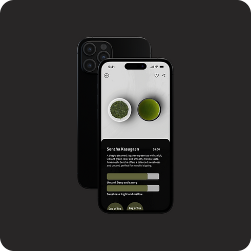
Simplified Navigation: Consolidated menu categories and introduced intuitive filtering (e.g., by tea type, caffeine level, flavor profile).
Streamlined Checkout: Reduced the process from 5 steps to 3 by combining shipping and payment information into a single, guided flow.
Calming Visual System: Implemented a neutral color palette, generous whitespace, and elegant typography to reduce visual noise and create a premium feel.


Design Highlights
Visual Design: Neutral palette, modern typography, and sumi-e-inspired layouts for clarity, calmness, and cultural resonance.
Design Impact:
-
Visual choices reinforce brand values and improve usability
-
Contributes to 35% longer average session duration and positive user feedback
The Impact: Measurable Serenity
The new design didn’t just look better—it performed significantly better by reducing friction and enhancing user satisfaction.
Checkout abandonment reduced by ~25%, directly attributable to the simplified flow.
Average session duration increased by 35%, indicating users were more engaged and less rushed.
Repeat visits grew from 10% to 28%, proving the experience fostered loyalty.
85% of test participants rated the new navigation as "intuitive" or "very intuitive."
Outcome
Minimalist, intuitive shopping experience aligned with Sumi Tea’s brand values of simplicity and balance.
Easy navigation & clear product descriptions reduced decision fatigue and improved usability.
Cultural + modern design blend encouraged repeat visits and strengthened brand loyalty.
Impact Metrics
Checkout abandonment reduced by ~25%
Average session duration +35%
Repeat visits grew from 10% → 28%
85% of usability test participants rated navigation as intuitive

Next Steps
-
Expand personalized recommendations and seasonal collections
-
Develop mobile onboarding and promotional campaigns